How Can We Help?
Appearance AIWU Chatbot Settings
Chat Appearance Settings
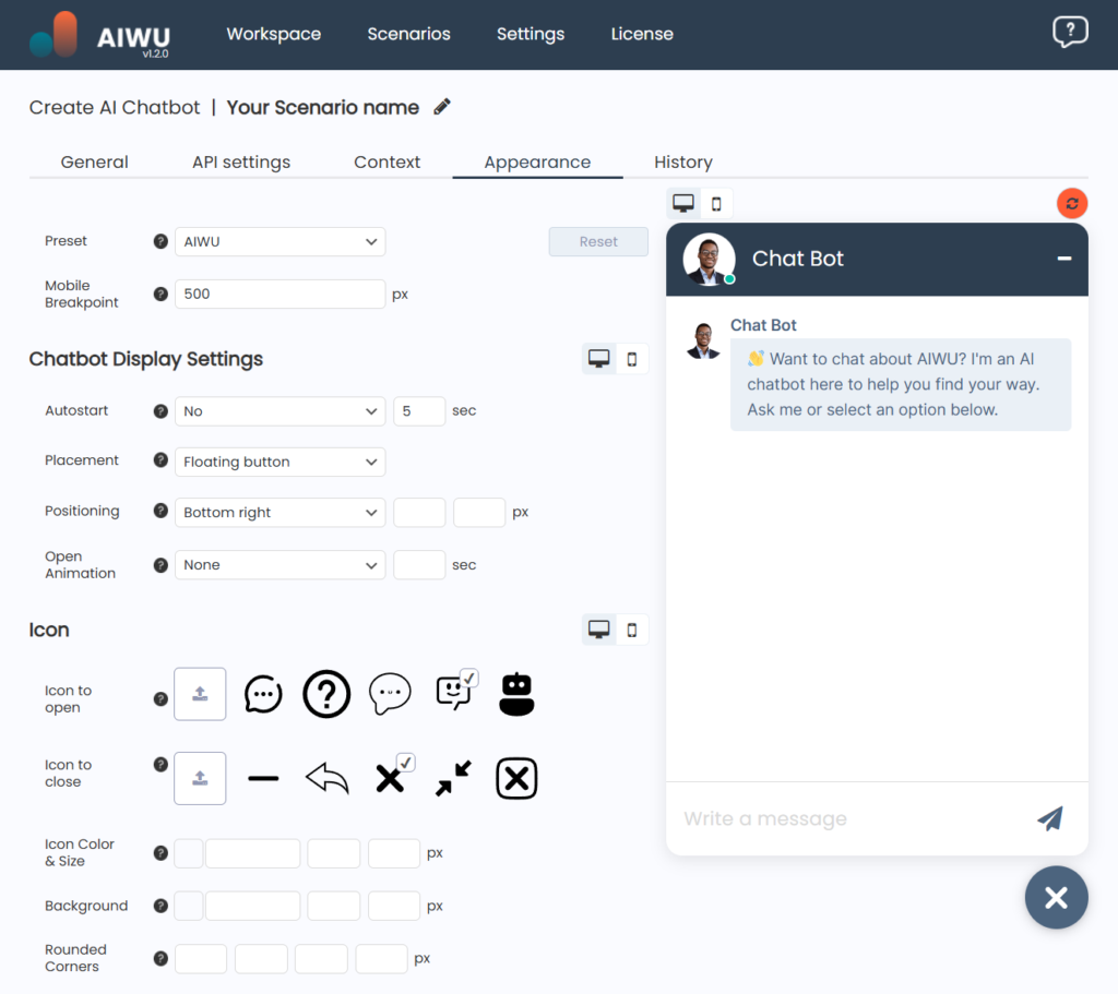
This section includes all the options needed for fine-tuning the visual appearance of the chat. A wide range of settings allows you to customize even the smallest elements, enabling you to create a unique chat design without any coding knowledge.
Preset
This menu offers a selection of pre-designed chat themes. Simply choose a preset that suits your style and save time on manual customization.
Mobile Breakpoint
Set the screen width at which a visitor’s device will be considered mobile for chat display purposes.
Chatbot Display Settings
- Autostart – Configure the chatbot to open automatically after a set time if the user hasn’t done so manually.
- Placement – Choose whether the chatbot button should be fixed in one place or floating on the screen.
- Positioning – Define where the chatbot button appears on the page, either by selecting a preset position or specifying exact pixel values.
- Open Animation – Select the opening animation type and adjust its duration for a smooth chat launch.
Icon Settings
- Icon to Open – Select or upload an icon for opening the chat.
- Icon to Close – Select or upload an icon for closing the chat.
- Icon Color & Size – Customize the color, width, and height of the icon (SVG).
- Background – Adjust the background width, height, and color.
- Rounded Corners – Define corner radius values individually for a unique look.
- Shadow – Configure shadow settings, including color, transparency, position, blur, and spread.
- Animation – Select an animation style for the icon.
Chat Window Settings
- Color & Size – Set the color, width, and height of the chat window.
- Rounded Corners – Adjust the corner radius of the chat window.
- Shadow – Configure the chat window’s shadow settings.
Header Settings
- Color & Size – Customize the color, height, left & right padding of the header.
- Content – Choose what appears in the header (chatbot name, avatar, custom text, or leave it empty).
- Avatar Size – Set the avatar size in pixels.
- Text – Customize the font, style, color, and size.
- Close Icon – Adjust the icon type, color, and size.
Messages Panel
AI Messages
- Color & Padding – Customize the background color and spacing of the message panel.
- Message Position & Size – Adjust the AI message placement and width.
- Message Content – Define what the AI message contains.
- Avatar Size – Set the AI avatar size.
- AI Name – Customize the font, style, color, and size of the AI’s display name.
- Message Box – Configure the appearance of the AI message container.
- Message Text – Adjust the font settings for AI responses.
- Message Time – Style the timestamp text for AI messages.
User Messages
- Position & Size – Choose the side and size where the user’s message appears in the chat.
- Message Content – Define the user message content (name, avatar, etc.).
- Avatar Size – Adjust the user avatar size.
- User Name – Customize the text appearance of the user’s name.
- Message Box – Configure the user message panel’s visual style.
- Message Text – Adjust the text styling for user messages.
- Message Time – Customize the appearance of the timestamp on user messages.
Welcome Buttons
- Color & Size – Adjust the appearance of welcome buttons.
- Borders – Customize the button borders.
- Text – Modify the button text’s font, style, and size.
- Rounded Corners – Adjust the corner radius of the buttons.
Footer Settings
- Color & Size – Customize the footer’s color, size, and padding.
- Input Text – Style the user input field text.
- Input Placeholder – Set a placeholder text for the input field.
- Send Icon – Adjust the icon type, color, and size for sending messages.
- Attachment Icon – Customize the appearance of the file attachment icon.
- Action Hover – Define the hover effect for action icons (e.g., send, attach).